


Most SaaS sites lose the visitor by explaining how the product works before saying why it matters. When we built Vexel, a live site for an AI sales-agent product, the whole design started from the outcome and worked backward.
Lead With the Result
A first-time visitor does not care about your architecture. They care about the change your product makes to their day. Vexel opens with a single sharp claim, turn conversations into conversions, and one sentence that names the outcome in plain language. Everything technical comes later, once the visitor already wants it. The rule we design by: the hero sells the result, the body earns the belief.
Turn the Workflow Into a Story
Complex products feel simple when the interface tells a story. Rather than list features, we structured Vexel around three verbs the buyer already understands: answer, qualify, convert. Each step is one idea with one visual, so the whole workflow reads in a single scroll. A visitor who can retell what your product does in three words is a visitor who can recommend it.
Make the Product Feel Real
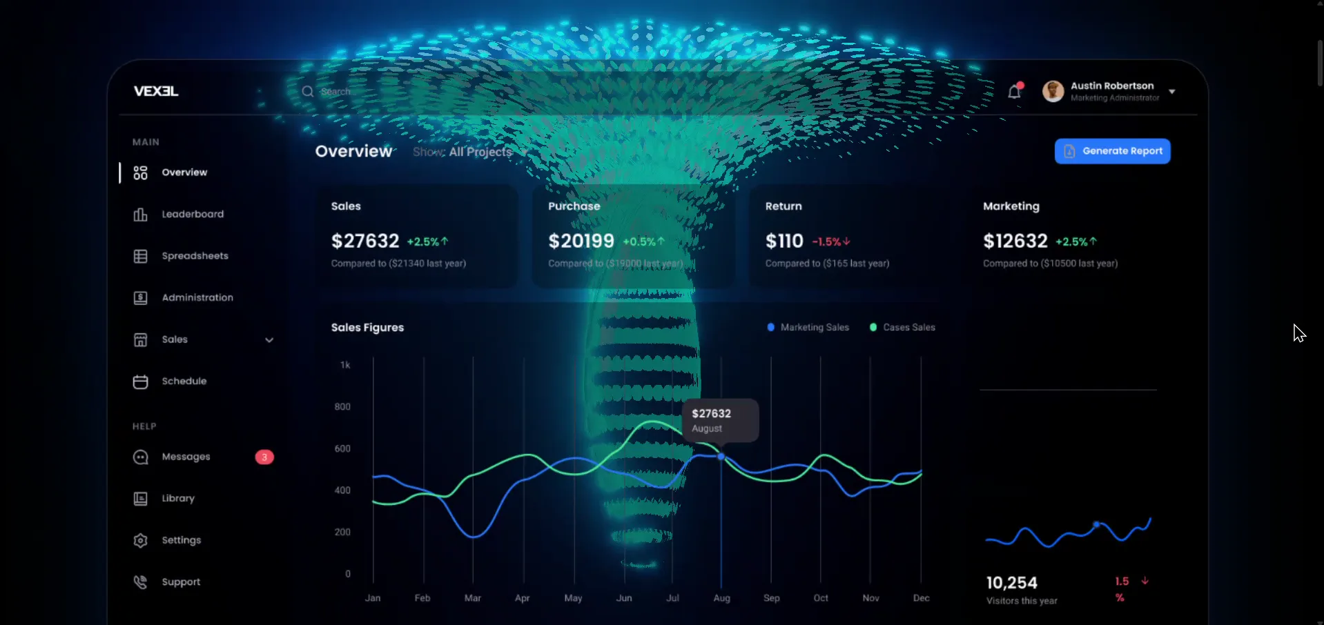
Stock screenshots read as stock. For Vexel we designed the dashboard as an actual component system, a sidebar, metric cards, tables, and charts that hang together like software a team would open every morning. When the interface in your hero looks like a tool people use, the promise above it becomes credible. Design the product surface with the same care as the marketing and the two reinforce each other.
Remove Hesitation at the Pricing Line
Pricing is where interest turns into a decision or an exit. We laid Vexel's tiers out for quick comparison, marked one clear recommendation, and kept the language plain. The goal of a pricing section is not to look impressive, it is to make the next click obvious. Fewer options, clearer framing, and one confident recommendation beat a dense matrix every time.
Conclusion
A SaaS landing page works when it respects the visitor's time: outcome first, a workflow they can retell, a product surface that feels real, and pricing that removes doubt. Vexel is live, and it reads clearly in one scroll because every section was designed to sell the result, not the technology behind it.