


Luxury does not shout. When we built EverGreen, a live site for a high-end architecture and real-estate studio, the hardest and most important discipline was knowing what to leave out.
Let the Work Breathe
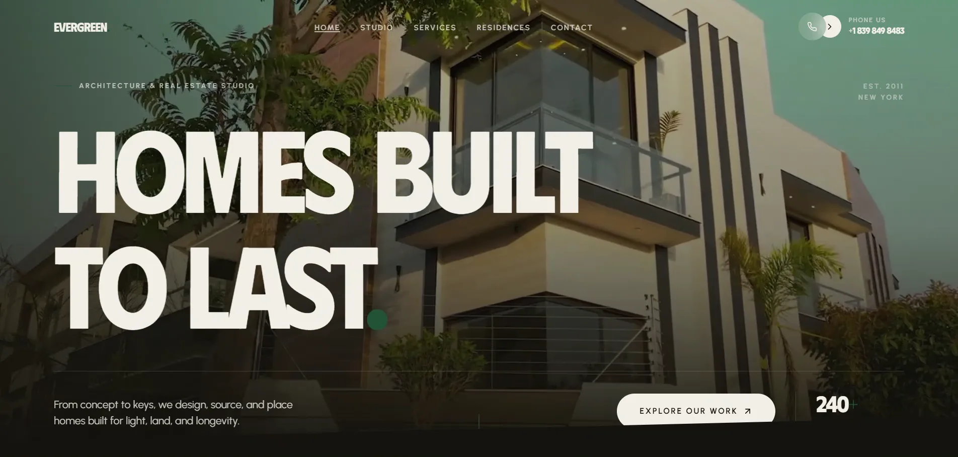
Premium brands earn their feeling through space. On EverGreen, full-bleed architectural photography leads every screen and the layout gives it room, wide margins, unhurried sections, nothing competing for attention. The interface deliberately steps back so the homes step forward. When the work is the product, the design's job is to disappear around it.
Quiet Typography Signals Confidence
Loud type reads as insecurity. EverGreen uses large display type sparingly and sets everything else in calm, confident sizes with generous spacing. A brand that trusts its work does not need to raise its voice on every line. Restraint in typography is one of the clearest signals of a premium brand, and one of the easiest to get wrong by overdoing it.
Structure Like an Editorial, Not a Catalogue
A luxury property brand cannot look like a listings portal. We organised EverGreen's services and residences into numbered, grid-based sections that read like the pages of a design magazine. The structure is deliberate and calm, guiding the eye rather than crowding it. Editorial pacing makes a browsing visitor feel like they are being shown something, not sold something.
Guide, Do Not Push
High-intent buyers resist hard selling. Instead of aggressive calls to action, EverGreen keeps a single, always-present, understated path to enquire. The site trusts the work to do the persuading and simply stays out of the way when the visitor is ready. For premium audiences, a calm invitation converts better than a loud demand.
Conclusion
Designing for luxury is an exercise in subtraction: give the work space, keep the type quiet, structure like an editorial, and guide gently. EverGreen is live, and it feels expensive not because of what we added, but because of what we had the discipline to leave out.